The Kym Yorker

Another dear friend has decided to leave The Big Apple.

I have known for months that Kym was moving back to the Bay Area, but as our last dinner was approaching a wave of sadness came over me. I am comforted by the fact that she is making the best decision for herself. And, if the past is any indication of the future, Kym is moving towards great things as was the case for my other friends Janice and Wendy when they closed their New York City chapters. You have to let go of one monkey bar to get to the next, right?

Kym’s departure coincided with my big apartment move. With the craziness of purging, packaging, and the pandemic, I was not in the headspace to create a thoughtful parting gift, but still felt the need to make something. It needed to be something simple and fast as I only had a day to work on this.

I was trying to think of things that screamed New York City. I thought ‘is there anything more quintessentially New York than the ‘The New Yorker’ tote?’ Though some may argue that this bag has run its trendy course, it is something I will spot almost every day walking around in the city.

MW-FT582_New_Yo_20170901160157_ZG.jpeg

Using the ‘The New Yorker’ as a basis I created a Kym Yorker version. Isn’t it so cute? I wish I time to print it on a tote.

nyc3.png

On the back side of this mini poster, I created a questionnaire with things to fill in like “favorite restaurants,” “favorite subway line” and the perfect day. I thought this would be the perfect way for Kym to put pen-to-paper and walk down memory lane.

nyc4.png
nyc2.png

I will miss you Kym! And, the delicious engagement chicken and maple syrup wontons you made for us. I am not so secretly hoping you will come back to the East Coast, but most importantly, wishing all things wonderful in your future. xoxo.

On the one-year anniversary of Parasite's historic Oscar wins

No, this is not an image error. I made a montage of the movie Parasite from beginning to end, inspired by something similar I saw at an art fair. One year ago today, Parasite won 4 Oscars, including Best Picture. I remember feeling a zing go through my entire body each time the South Korean movie was named the winner.

First frame

First frame

Last frame

Last frame

I know I am probably partial to Parasite because I am Korean. But, how can you not appreciate Director Bong Joon Ho's meticulous eye: the first and last frame being the same shot, a simple doorbell ring marking the midpoint of the movie and switch of genres, sourcing a $2,300 German trash can to show how wealthy the rich family is, the rich home set being built facing a specific direction to ensure the sunlight came in just right. No wonder his nickname is Bong-tail. And, the movie's theme of the haves, have nots and have even less is an uncomfortable but much needed mirror to our society. Relevant today when you see how people are impacted so differently by COVID based on their socioeconomic and racial backgrounds.

Parasite's recognition with the fans and critics felt like a watershed moment for Asians and Asian Americans in media. But, at the same time progress can be slow and is not always linear. The rise of attacks on Asians since the start of the pandemic feel like a setback and I am reminded that words, thoughts and representation matter. As Bong accepted his Best Director award, he thanked his longtime hero Martin Scorsese for the words "the most personal is the most creative." May we all feel empowered to tell our own story in whatever form and in turn create a better, more compassionate and inspiring world. 🍑

New York City Pizza Crawl

One of my closest friends here in New York is moving to LA tomorrow and I am pretty bummed about it. This move has been in the works for a couple of years now, but it still feels surreal to know that Janice will no longer be here anymore. Who will I hang out with?!

Well, a few weeks ago I asked Janice what she wanted to do for our last one-on-one hangout. I was surprised when she texted back “I wanted to do a pizza crawl.” She confessed that even after so many years in the Big Apple she never had that amazing New York pizza slice that everyone always raves about.

Honestly, I was not too thrilled about doing a pizza crawl as I am usually full after just one slice – how would I be able to chow down on three or four? I replied with a noncommittal answer and let a few days pass. But, the more I thought about it, the more convinced I became that I should plan this crawl. Fulfilling my friend’s simple wish was more important than me worrying about my stomach’s capacity.

So the planning began, with me combing through pizza lists on sites like Eater and Thrillist, watching pizza reviews on YouTube, mapping out locations on My Google Maps to figure out the best route and just letting my creative juices flow to bring this crawl to life.

First, I designed an evite featuring this perfectly-themed illustration I came across on Pinterest. I just found out while writing this post that it is by an Mexican-born artist Ilse Valfré based in LA – if this is not a sign I do not know what is!

YouAndNah_New_York_City_Pizza_Crawl_evite.jpg

It was nearly impossible to choose just five spots as there are hundreds of pizza places in the city. I reluctantly decided to stick to places that sold slices as it would be impossible for us to eat a whole pizza at multiple locations. Hence, sit-down restaurants like Lucali, Emmy, Roberta’s and L&B Spumoni Gardens were crossed out. I tried to have a good mix of classic spots and a couple lesser known hidden gems. Once, I decided on the locations, I designed a pizza-shaped card with a short description for each place we would hit up.

YouAndNah_New_York_City_Pizza_Crawl_Design1.jpg
YouAndNah_New_York_City_Pizza_Crawl_Design2.jpg
YouAndNah_New_York_City_Pizza_Crawl_Design3.jpg
AIMG_5685.JPG

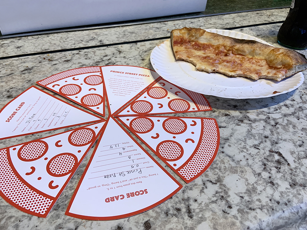
And, what is a pizza crawl without some score cards? We would rate each pizza from one to five in the categories of crust, cheese, sauce, appearance and value.

AIMG_5690.JPG

I inserted each description card and two score cards, one for me and one for Janice, in a brown paper envelope that was a nod to the color and texture of a cardboard pizza box.

AIMG_5676.JPG
AIMG_5695.JPG

Before arriving at each location, I gave Janice an envelope that she would open to reveal where we were going. Here are the spots and the descriptions that were on each card. Let the drooling begin!

IMG_5698.JPG

Location One
Di Fara Pizza

82-year-old owner Dom DeMarco has been making pizzas in this Midwood spot since 1964. These pies come slathered in a San Marzano tomato sauce, generously topped with parmesan, a leaf or two of fresh basil, and a heavy drizzle of olive oil poured from a silver can.

1424 Avenue J, Brooklyn, NY

Rating: ★ ★ ★ ★ ★

IMG_8769.JPG
a.jpg

LOCATION TWO
NY Pizza Suprema

It is fair to be skeptical with the storefront banner proclaiming they have the #1 pizza slice in Manhattan. But, this no-frill spot near MSG is turning out cheap slices that have impressed even the most hardened pizza aficionados. The crust is stiff enough for folding yet oily enough to stay moist.

413 8th Avenue, New York, NY

Rating: ★ ★ ★ ★

IMG_5700.JPG
IMG_5707.JPG
IMG_8774.JPG

IMG_5708.JPG

Location THREE
L’INDUSTRIE PIZZERIA

Located in Williamsburg, L’industrie is a cash-only shop owned by Florence native Massimo Laveglia. With a perfect five score on Yelp, you can expect the use of high-quality ingredients to dish out classics like the Margherita and fancier options with proscuitto and truffle sauce imported from Italy. 

254 South 2nd Street, Brooklyn, NY

Rating: ★ ★ ★ ★ ½

IMG_5709.JPG
IMG_8778.JPG
IMG_8785.JPG

Location FOUR
Prince Street Pizza

This Noho shop took over the space of the oldest Ray’s Pizza — another iconic New York City pizza brand. The Spicy Spring is the signature here, a Sicilian style square topped with fra diavolo sauce, fresh mozzarella and spicy pepperoni that curl up into little grease-filled cups of pure heaven.

27 Prince Street, New York, NY

Rating: ★ ★ ★

IMG_5715.JPG
IMG_5714.JPG
IMG_5716.JPG

IMG_5720.JPG

Location FIVE
Joe's Pizza

Joe’s is home to the quintessential New York slice, compromised of a crust that is equal parts thin and crispy and even layers of cheese and tomato sauce. The shop was opened in 1975 by Joe Pozzuoli, who is originally from Naples, Italy, the birthplace of pizza. Beware of copycat locations. 

7 Carmine Street, New York, NY

Rating: ★ ★ ★ ★

IMG_5719.JPG
IMG_5721.JPG

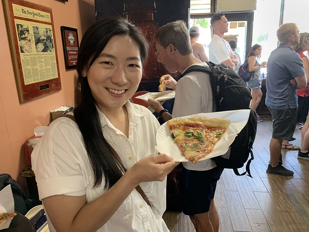
You may be wondering which was our favorite. Both of us absolutely loved DiFara. My theory on why it tasted so good was because the pizza was made fresh and not reheated in the oven like the others…but who knows. I will definitely go again – I did not realize that it is a quick train ride from my apartment.

IMG_8768.JPG
IMG_8767.JPG

I was worried that we would be done with the crawl really quickly so I had some activity fillers in my back pocket like watching a movie, walking the Manhattan Bridge, going to the Renegrade Craft Fair or the Mermaid Parade. But, just visiting the five pizza spots was a full-day adventure. We started at noon and finished around 8pm, with a pitstop at Sister City for a drink.

This was such a fun experience, trying some really delicious pizza, encountering random characters on the street and sketchy train (woman who asked for my seat) and making wonderful memories with my dear friend while being reminded how special and diverse the city of New York City is.

IMG_8806.JPG

In closing, a note to Janice: Thank you for coming into my life in my early years of living in New York when I was trying to find some solid girlfriends who I could have meaningful connections with. I am really debating if I should get back on Hey! Vina now that you will be gone.

Growing up, my dad had a framed poster hanging in our house with various life lessons on it. One I always remembered is ‘do not hold back those who are leaving.’ (가는 사람 잡지 마라) As I said at the beginning of this post, I am really bummed that you are leaving New York City and wish you would stay. But, my excitement outweighs my sadness as you step into the next chapter of life in LA where you will really be able to grow into your fullest potential and shine as an artist.

All the best Tree Neck…I cannot wait for the day I am watching a show or movie and see your name in the end credits and can scream, “Yesssssssh! That’s my girrrrrrrrrl!” Love you.

Logo Study Inspired by Supermoon Bakery

Anything iridescent is having a moment right now and I am here for it. I have seen girls with iridescent PVC bags and when I saw someone with an umbrella very similar to the one below, I was really tempted to get one. But, I refrained as I am really making an effort to buy less things – it is better for my wallet and for the environment.

YouAndNah_SuperMoonBakery_Iridescent_Logo_Umbrella.jpg

Well, a couple months ago, my friend and I went to Supermoon Bakehouse to try their Instafamous croissants. I was immediately struck by their minimalist space that was punctuated by a grand strawberry milk colored marbled table. The prettiest croissants you have ever seen were on display like works of art. And, stacked against the wall were iridescent boxes that changed colors as you moved across them that just made me want to applaude and say “man, whoever did the branding/design/packaging for this place really is so on trend.”

YouAndNah_SuperMoonBakery_Inspiration2.jpg
 

good design is my eye candy.

I should have been more focused on the delicious treats, but the graphic designer side of me was more obsessed with the boxes and the 3D type treatment of the logo.
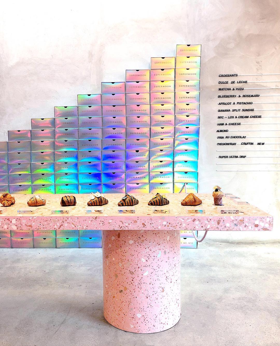
I thought it would be fun to see what other well-known brands would look like with the same iridescent background and type treatment. This was a fun exercise that gave me an opportunity to try out some different Photoshop effects and reimagine some iconic logos in a playful and unexpected way.

YouAndNah_SuperMoonBakery_Iridescent_Logo_Chanel.jpg
YouAndNah_SuperMoonBakery_Iridescent_Logo_Starbucks.jpg
YouAndNah_SuperMoonBakery_Iridescent_Logo_Instagram.jpg
YouAndNah_SuperMoonBakery_Iridescent_Logo_Sanrio.jpg
YouAndNah_SuperMoonBakery_Iridescent_Logo_Gucci.jpg
YouAndNah_SuperMoonBakery_Iridescent_Logo_StrangerThings.jpg
YouAndNah_SuperMoonBakery_Iridescent_Logo_McDonalds.jpg
YouAndNah_SuperMoonBakery_Iridescent_Logo_TraderJoes.jpg
YouAndNah_SuperMoonBakery_Iridescent_Logo_Pinkberry.jpg
YouAndNah_SuperMoonBakery_Iridescent_Logo_Allbirds.jpg

Sweet Taste Test: DIY Box of Gummies

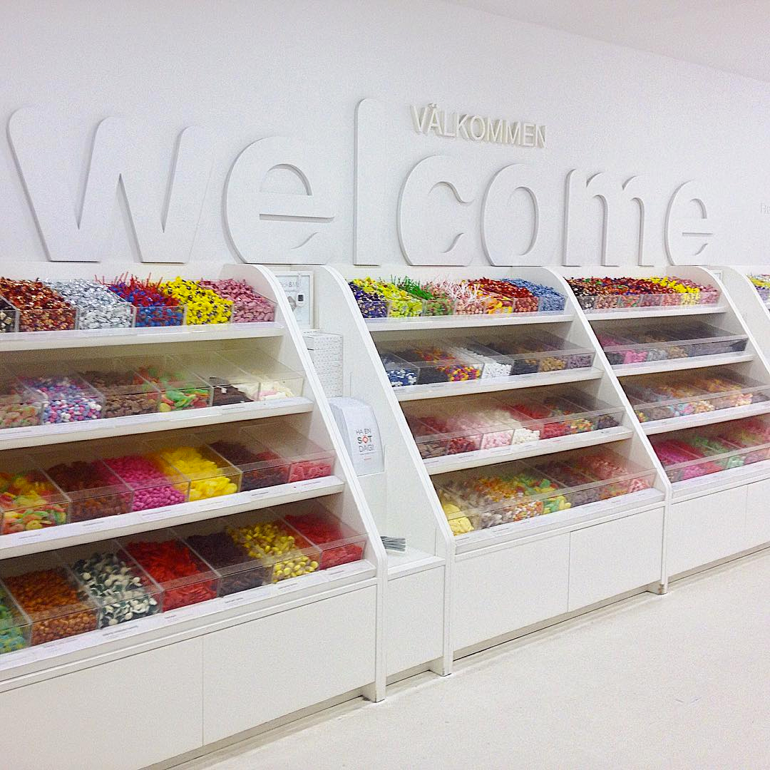
I absolutely love gummy candies. So imagine my excitement when I stumbled upon Sockerbit, a charming Swedish candy shop in New York City's West Village. It is a candy lover's paradise with a plethora of gummy treats to choose from in a minimally-designed space that is undeniably Scandinavian.

After joyfully eating through half of my purchased sweets even before I made it home, I was inspired to send some to my boyfriend back in California. Of course, I would make a DIY project out it, designing a custom candy box filled with treats for him to sample.

ThenComesColor_DIY_SweetTasteTest_Sockerbit2.jpg

I began my project by taking a trip back to Sockerbit and picking out sixteen different gummies. It was really hard to narrow down my selection but I tried to pick a variety of flavors, colors and shapes. I also tried to make sure they would comfortably fit into the candy box. Aren't they all so colorful and pretty!?

ThenComesColor_SweetTasteTest_Gummies.jpg

I would need to design a few printed items to bring this candy box to life. I began by creating a box liner with each gummy's name and assigned number on it.

ThenComesColor_DIY_SweetTasteTest_Lining1.jpg

I inserted the box liner into the base of a plain white box that I got at a craft store. This box measured 4.37"(L) x 5.75"(W) x 1"(H).

ThenComesColor_DIY_SweetTasteTest_Box.jpg
ThenComesColor_DIY_SweetTasteTest_Lining2.jpg

A box label reading "Sweet Taste Test" was adhered to the center of the lid.

ThenComesColor_DIY_SweetTasteTest_Label.jpg
ThenComesColor_DIY_SweetTasteTest_Lining3.jpg

Next onto the box divider. I cut three strips of cardstock to fit the width and height of the box and three strips to fit the length and height. Then I cut three evenly-spaced slits in each strip, making sure not to cut all the way through. I, then, carefully inserted the strips into one another to create a secure interlocking piece, as seen in the below right image.  

ThenComesColor_DIY_SweetTasteTest_Divider1.jpg
ThenComesColor_DIY_SweetTasteTest_Divider2.jpg

The divider fit perfectly into the box. What a relief!

ThenComesColor_DIY_SweetTasteTest_Divider3.jpg
ThenComesColor_DIY_SweetTasteTest_Divider4.jpg

Next, I designed a score card that asked my boyfriend to rate each gummy on a scale of 1 to 10, with 10 being the tastiest. The scorecard also asked if each gummy tasted better than my favorite gummy of all time, Autodrop Cadillacs from Holland. They are the only things that make my tastebuds literally jump when I think about them. I am salivating right now!

ThenComesColor_DIY_SweetTasteTest_ScoreCard.jpg

And finally a note card with a poem. As what candy box would be complete without a one? Definitely not this one.

ThenComesColor_DIY_SweetTasteTest_Poem.jpg

Now for the best part! Placing each gummy into its new home.  

ThenComesColor_DIY_SweetTasteTest_Gummies2.jpg

Assembling everything together.

ThenComesColor_DIY_SweetTasteTest_Complete1.jpg
ThenComesColor_DIY_SweetTasteTest_Complete2.jpg

The finished candy box came out better than I would have expected. It was too cute to part with but off I shipped it to the West Coast knowing how much my boyfriend would get a kick out of this surprise gift. He absolutely loved all the gummies, especially the #Social candy ones but we both agreed that nothing beats the taste of an Autodrop Cadillac.

This was a really fun and unexpected project that was not only so much fun to make but tasty as well. I think I may need to head over to Sockerbit soon to get my sweet fix!  

ThenComesColor_DIY_SweetTasteTest_Complete3.jpg

Oh so sweet! DIY gift

ThenComesColor_DIY_SweetTasteTest_Complete4.jpg
ThenComesColor_DIY_SweetTasteTest_Complete5.jpg