Logo Study Inspired by Supermoon Bakery

Anything iridescent is having a moment right now and I am here for it. I have seen girls with iridescent PVC bags and when I saw someone with an umbrella very similar to the one below, I was really tempted to get one. But, I refrained as I am really making an effort to buy less things – it is better for my wallet and for the environment.

YouAndNah_SuperMoonBakery_Iridescent_Logo_Umbrella.jpg

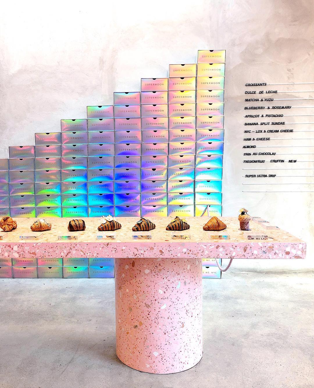
Well, a couple months ago, my friend and I went to Supermoon Bakehouse to try their Instafamous croissants. I was immediately struck by their minimalist space that was punctuated by a grand strawberry milk colored marbled table. The prettiest croissants you have ever seen were on display like works of art. And, stacked against the wall were iridescent boxes that changed colors as you moved across them that just made me want to applaude and say “man, whoever did the branding/design/packaging for this place really is so on trend.”

YouAndNah_SuperMoonBakery_Inspiration2.jpg
 

good design is my eye candy.

I should have been more focused on the delicious treats, but the graphic designer side of me was more obsessed with the boxes and the 3D type treatment of the logo.

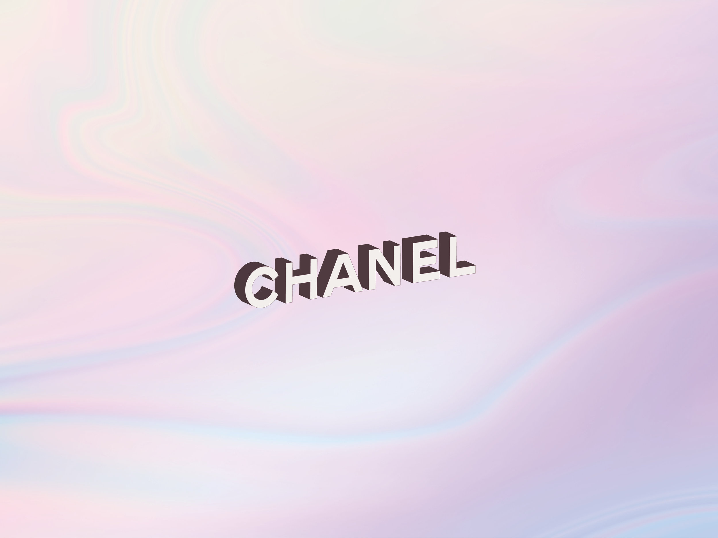
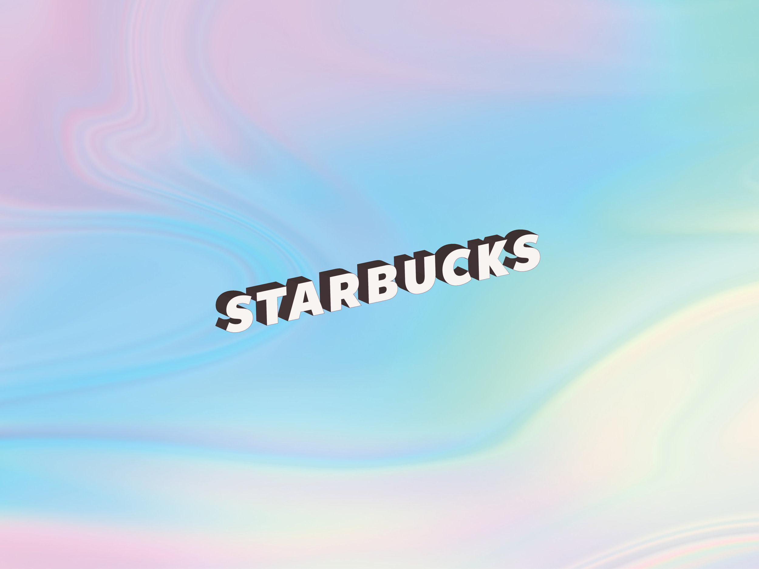
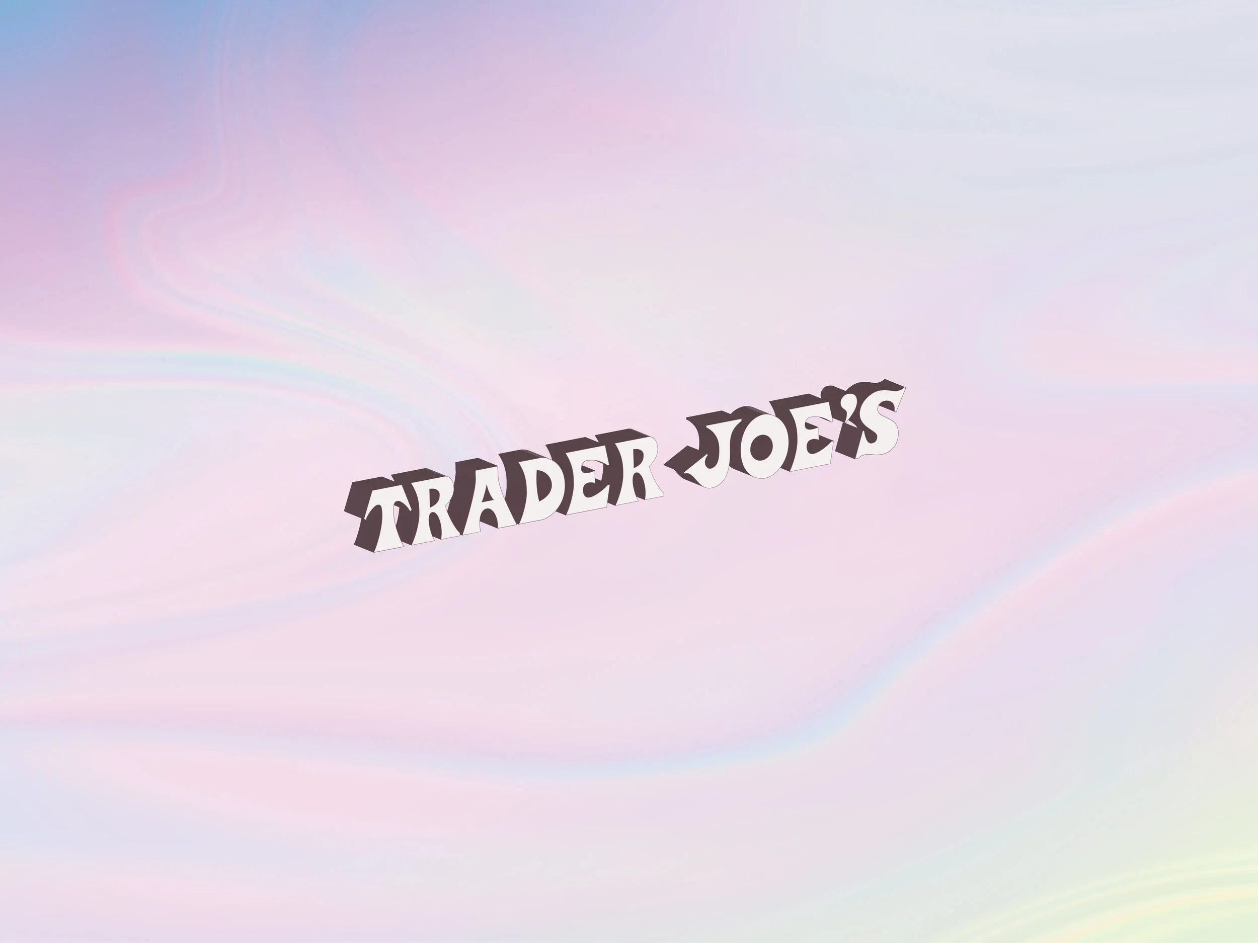
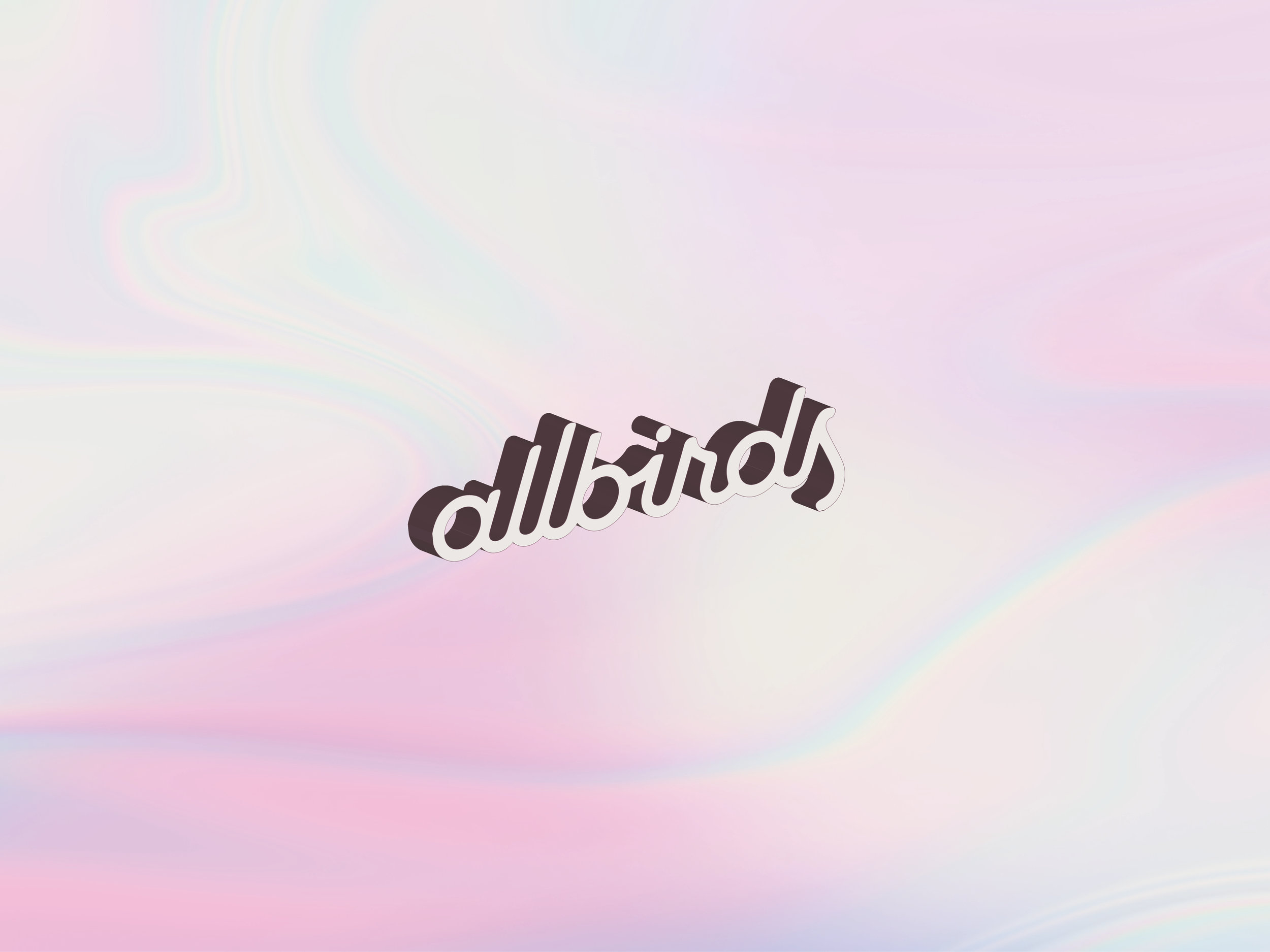
I thought it would be fun to see what other well-known brands would look like with the same iridescent background and type treatment. This was a fun exercise that gave me an opportunity to try out some different Photoshop effects and reimagine some iconic logos in a playful and unexpected way.
YouAndNah_SuperMoonBakery_Iridescent_Logo_Chanel.jpg
YouAndNah_SuperMoonBakery_Iridescent_Logo_Starbucks.jpg
YouAndNah_SuperMoonBakery_Iridescent_Logo_Instagram.jpg
YouAndNah_SuperMoonBakery_Iridescent_Logo_Sanrio.jpg
YouAndNah_SuperMoonBakery_Iridescent_Logo_Gucci.jpg
YouAndNah_SuperMoonBakery_Iridescent_Logo_StrangerThings.jpg
YouAndNah_SuperMoonBakery_Iridescent_Logo_McDonalds.jpg
YouAndNah_SuperMoonBakery_Iridescent_Logo_TraderJoes.jpg
YouAndNah_SuperMoonBakery_Iridescent_Logo_Pinkberry.jpg
YouAndNah_SuperMoonBakery_Iridescent_Logo_Allbirds.jpg

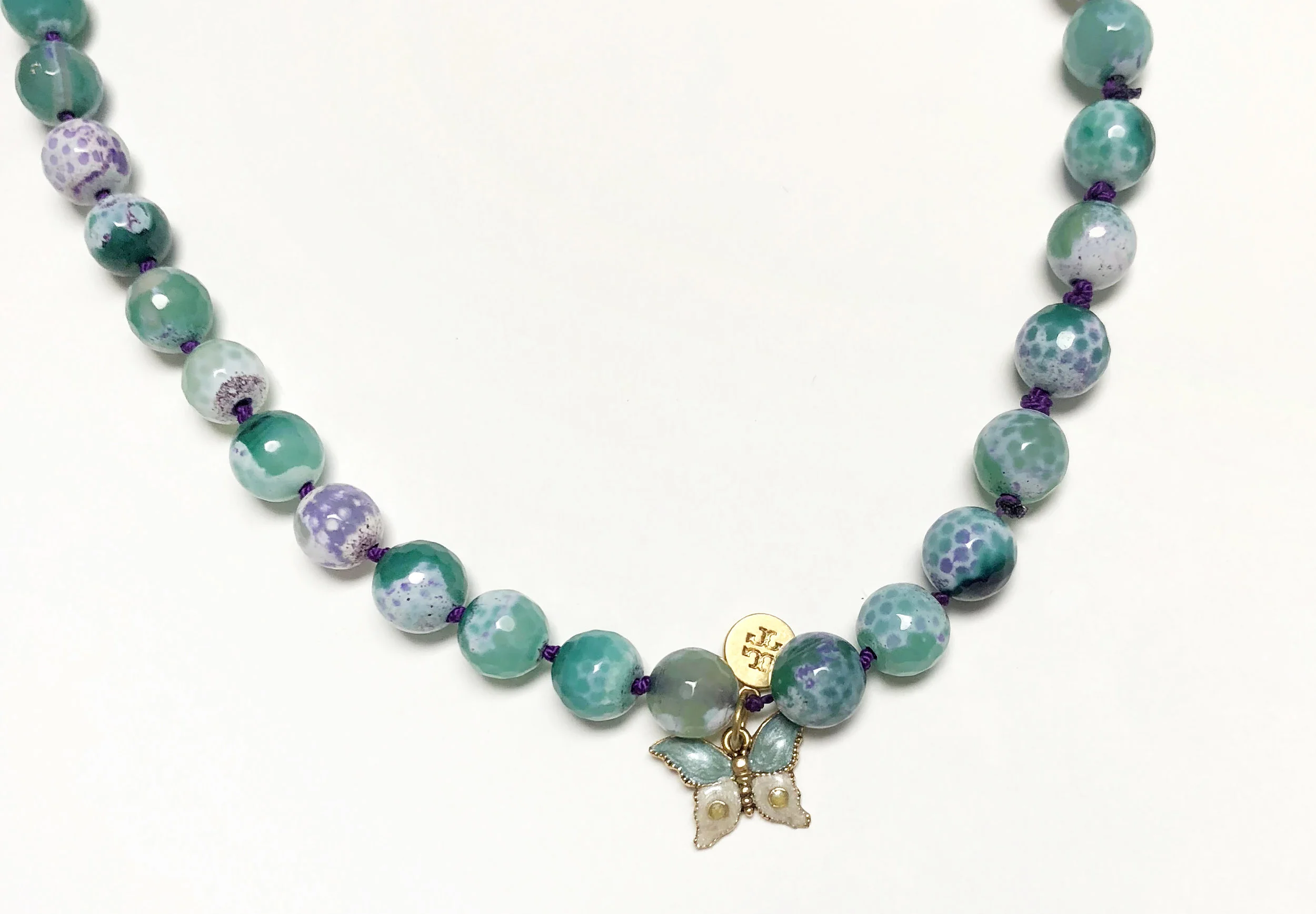
Crab Fire Agate Necklace

As my boss’s last day was fast approaching, what I should get him for a parting gift loomed over my head.

During my time at Tory Burch, Nicholas taught me how to be a better graphic designer who is disciplined with rules and ratios when working on layouts and, on the flip side of the designer coin, how to be a loose and free-flowing creative when brainstorming new ideas. But, more importantly, Nicholas has shown me what it means to be a kind person who practices gratitude daily, a person who will befriend anyone and light up a room with his shameless dancing and heartfelt laugh and someone who will be the biggest advocate for things he believes in. So, for someone like this, who will leave a hole in our team, what do you get?

I wanted whatever I got him to be thoughtful. Over the recent years I have become more sensitive to how much humans consume and waste and I try to refrain from shopping so much, though those sales on ASOS and Anthropologie are always so darn tempting. I toyed with a few different gift ideas but the one that stuck out as the one was a handmade bead necklace.

Nicholas has a collection of colorful beaded necklaces that he likes to rotate through. He would come back from visiting his mom, a gemologist (I hope I am getting that right), with a necklace or two that they handmade together. He always wears them with love and so I wanted to make a piece that he could wear and be reminded of all the good times at Tory Burch.


I popped into Bead Center and walked around the shop looking for beads that were colorful and unusual in texture. I scanned the rows and rows of beads to see which would speak to me.

YouAndNah_DIY_Crab_Fire_Agate_Necklace_Bead_Center.jpg

It sounds crazy but with things like fabric prints and, in this case, beads, those that catch my eye will say “hi” while those that do not appeal to me stare back silently. Well, these beautiful crab fire agate beads, irregularly splashed with hues of turquoise, mints, and purples definitely shouted “hey, girl!”

YouAndNah_DIY_Crab_Fire_Agate_Necklace_1.jpg
YouAndNah_DIY_Crab_Fire_Agate_Necklace_2.jpg
 

I picked up purple knotting cord and a small butterfly charm as the critter is symbolic to Nicholas. After watching several YouTube tutorials on how to string beads I got to work, pulling each knot with extra force in fear that the whole necklace will unravel. I went through all my Tory Burch jewelry to see if I could find a branded charm that I could remove and attached to the necklace. Luckily, I found one that was discreet but still noticeable.

YouAndNah_DIY_Crab_Fire_Agate_Necklace_3.jpg

I gave the necklace to Nicholas the night before his last day of work and I think he really liked it. Phew! And, I fingers-crossed his mom will find the beads to be of decent quality (the horror if I find out they are fake!) He did mention that good stones will feel heavy and cold to the touch, both of which I observed while stringing the beads. Anyways, all the best to NK – we will miss your laugh, your spirit and your constant preaching of how fabulous Mariah Carey is. “Don’t forget about us.”

Clockwise from the top:  • Nicholas’ necklace collection with the one I made now a part of the family. I was not kidding about his love of necklaces.  • A drawing of me that Nicholas did in his signature “huge smiling head with tiny limbs” style. • …

Clockwise from the top:
• Nicholas’ necklace collection with the one I made now a part of the family. I was not kidding about his love of necklaces.
• A drawing of me that Nicholas did in his signature “huge smiling head with tiny limbs” style.
• Heart icon he designed in response to the 2016 Orlando shooting to symbolize spreading love, which has turned into a passion project of his.
• Us taking the Q train home after team drinks on the eve of Nicholas’s last day. Bittersweet.
• Rainbow - a term Nicholas coined to commend someone for looking extra fly, inspired by me after I started putting in effort into dressing better.

Aura Reading & Embroidery Inspired Birthday Card

For my friend Wendy’s birthday I was feeling artsy and wanted to make her a card instead of buying one.

A little background about Wendy: I met her when I first moved to New York and over the past year our friendship has grown and I have come to really adore her great fashion sense, corky humor and kindhearted spirit. And when I found out that we shared a mutual passion for Oprah and Flamin' Hot Cheetos I was convinced that I found my soul mate. No, I am not kidding.

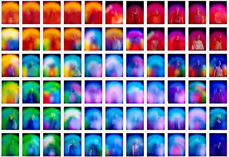
Well, Wendy and a few of our friends regularly get their auras read. I have yet to do an aura reading myself so am not 100% sure what it entails but to my understanding a photo is taken of you, and what is revealed is an image of yourself accompanied by different colors that correspond to the energy fields that you are emanating. What is going on your life will determine what colors will appear in your reading.

Color Meanings: Red (vital), orange (optimistic), yellow (creative), green (healing), blue (tranquil), purple (magical)

Knowing that Wendy was going through a transitional time in her life I wanted to create something that was vibrant and incorporated as many colors as possible – to shower her with as many positive energies via a birthday card. During this time I was also feeling a bit fatigued with using only the color black with my floral illustrations so I was really relieved to ‘paint’ the rainbow. In addition, I was reminded of these beautiful embroidery paintings by Sabatina Leccia I had pinned awhile ago. They are just so lovely in their texture, color and fluidity.

YouNah_Wendy_Card_Sabatina_Leccia2.jpg
YouNah_Wendy_Card_Sabatina_Leccia.jpg
YouNah_Wendy_Card_Sabatina_Leccia4.jpg
YouNah_Wendy_Card_Complete1.jpg

PAINTing OUTSIDe THE LINES…the lines that sometimes don’t exist.

I will say I am the type of person who colors inside the lines but in this instance I had the paints guide me to where ever they wanted to go. In between each brush stroke of acrylic paint, I would add water droplets and rotate the paper up and down and side to side so that the wet liquids would roll and bleed into each other. Then I stippled dots with the pointed end of a skewer stick to mimic the embroidery in Sabatina’s work.

I was quite happy with how this little piece came out. I knew I wanted to incorporate the colors of the rainbow in an organic and fluid way that would celebrate all the vibrancies of life that would serve as a small reminder for Wendy that life has its ups and downs but that we are all constant ‘works in progress’ and that the important thing is continuously strive to grow and elevate ourselves.

Happy birthday to my friend Wendy. I wish all good things for her in 2019 and that this random card brings her the same bit of serenity and joy that I felt while painting it.

And I cannot think of a more appropriate way to end this post then with an Oprah quote:

“The biggest adventure you can ever take is to live the life of your dreams.”

YouNah_Wendy_Card_Complete2.jpg